This image has been resized. Click on the View larger version link in the sidebar for a high-quality version.
Hide this message.
Image samples have been disabled. If you find this to be too slow, you can turn samples back on in your profile settings.
This post has a child post. (post #300539)
« Previous Next » This post is #1 in the Dengeki Hime 2014-11 pool.
Search
Tags
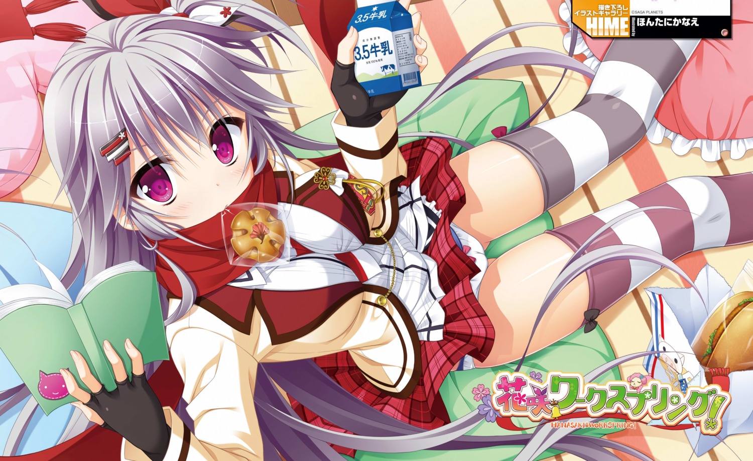
- ? saga planets 991
- ? hontani kanae 789
- ? hanasaki work spring 145
- ? shiranui inori 60
- ? cameltoe 54200
- ? digital version 7844
- ? pantsu 169765
- ? seifuku 149802
- ? thighhighs 250153 panties school uniform camel toe pantsuga ほんたにかなえ underwear seifuku shoujo torn thighhighs serafuku thighighs pantsu2 tighhighs panties under pantyhose thighhigh pink panties school girl schoolgirl hold-ups black panties pink pantsu blue pantsu pantsy thighboots thigh boots bow panties white panties white thighhighs red panties frilled panties visable panties panty peek blue panties orange panties single thighhigh lace panties frilled thighhighs maid panties black thighhighs
Statistics
- Id: 300093
- Posted: about 10 years ago by edogawaconan
- Size: 3268x2000
- Rating: Questionable
- Score: 122
- Favorited by: Lilykaz, AnimeFan18, h2oaaaa, 5002, yohong86, jimmy123321, ghost941, petak11, 513319046, 崔亚丁, pencil5cm, Pogi, orochidrako, 空中杀手, Lovely_Kotori, Veta91, Relow, 1125914224, Xerneas26, Galaxy0501, Hyper_187, 忘卻的路人甲, Anuca, Christown, jackjtr, Zenex, xu3vup4vu06, cutecollect, ri2280548722, Lamii, Komamisa, TheCheese, Ruffette, oronaldo, Yincus, nihao, JCorange, airei, mzlks, felix430, kanashi, wrt5544gg, fredomone, johnny384316, kyt30, kamueee, Rambo99, a8295204, Slarkero, ABFFF7, YunGoon, syuki144, Kalessin, alma79, ctrl450, neckprpr, TopSpoiler, nanaya7, autumnnnrain, tangerineCC, atttta, kinta, mrmadpad, marvell, eminanaya, vita, SeeThrough, geminis, maxi99, JLainez, soddein, LKM, darkdream, 暗自神伤, xxxalice, kran, Akseru, diablo330, nutari, asxdvb, AspenExcel, CWC, Twinsenzw, Estraizher, hadaima, azure4488, Azarel, lazymushi, 35Myziki, makiechang, 神前美月, lichtzhang, gaomignhj, edogawaconan, nagisa2527 (89 more)
Twinsenzw
about 10 years agofull file here
BTW, the pics from rip are in .jpeg. Since you have to stitch wallpapers, uploading a png still does make sense.
Xcalibur
about 10 years agoblooregardo
about 10 years agoXcalibur
about 10 years agoHave you ever tried watching your favorite movie with aggressive post-processing to remove all of the noise?
We all have our preferences of course. If everybody agreed with me nobody would make vector traces.
fireattack
about 10 years agoTechnically the scan of 2d image, in practice, is actually more close to "aggressive post-processing" image than the raws.
I know someone likes the feeling of noise in old film movies, but the screening is very distinguish from it, not to mention most of scans are just filtered all of them (and details).
In my opinion you maybe more like the oversaturated color, which is the major difference between scans and raws.
Radioactive
about 10 years agoXcalibur
about 10 years agoThis probably isn't translating either. Oh well, hey, I was able to render Radioactive speechless. That's an achievement of sorts right?
Kawaiideath
about 10 years agololi92
about 10 years ago