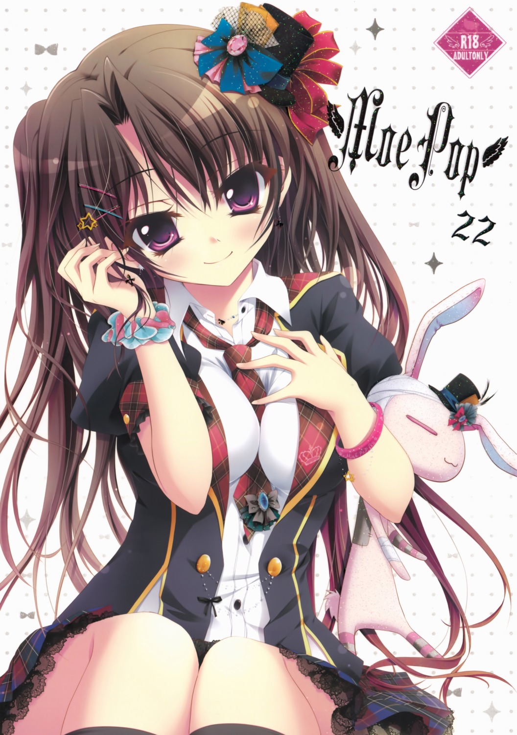
This image has been resized. Click on the View larger version link in the sidebar for a high-quality version.
Hide this message.
Image samples have been disabled. If you find this to be too slow, you can turn samples back on in your profile settings.
Search
Tags
- ? hisuitei 483
- ? izumi tsubasu 1229
- ? breast hold 40027
- ? seifuku 150606 school uniform 和泉つばす seifuku shoujo serafuku school girl schoolgirl holding breast
Statistics
- Id: 239206
- Posted: almost 12 years ago by 13610145264
- Size: 3000x4261
- Rating: Safe
- Score: 75
- Favorited by: alertnet, 高坂, Destructodoom, hira390, qingxinyuyue, imeno, Midaregami, Relow, killercwb, SamheinDM, Azarel, Lamii, icgeass, ctrl450, AspenExcel, makiechang, princesses, movement, Snarby, akirawen, IIMaximoII, qwwiknxono, MorrowindGod, kimhoaht, threesiko, PinkieLove, pty_haywire, WtfCakes, nooanianqueetus, mula3, kaelsmith, ditama, tangerineCC, yangheli22, tbchyu001, captainwoodroe, Chiii, ast401418, aimini, einishi, Koyomi, edogawaconan, nphuongsun93, sumchui00, 炽热之瞳, KazukiNanako, boberyang, lcx2475, fairyren, Kalessin, dragoncaliber, Elitemiku, soddein, sokusan, kran, CWC, lazymushi, airei, fireattack, nutari, Unctuous, azure4488 (56 more)


WtfCakes
almost 12 years agoaoie emesai
almost 12 years agofireattack
almost 12 years agoaoie emesai
almost 12 years agoBut yeah second thought after looking much more carefully, best to keep this one too. I think you undeleted it too quickly where i couldn't view the deletion too.
nutari
almost 12 years agoXcalibur
almost 12 years agofireattack
almost 12 years agoedit: check http://hisuitei.com/c83%20kokuti.html
WtfCakes
almost 12 years agoXcalibur
almost 12 years agofireattack
almost 12 years agoMy point is simple, it needs to adjust midtone, black level or whatever to make it 'darker', but white level itself is ok.
WtfCakes
almost 12 years agoBut as fireattack said, midtones are a bit washed.
Xcalibur
almost 12 years ago*shrug* It doesn't look bad either way.