Close
This post has a child post. (post #243155)


suzumiya_haruhi suzumiya_haruhi_no_yuuutsu transparent_png vector_trace

Edit | Respond

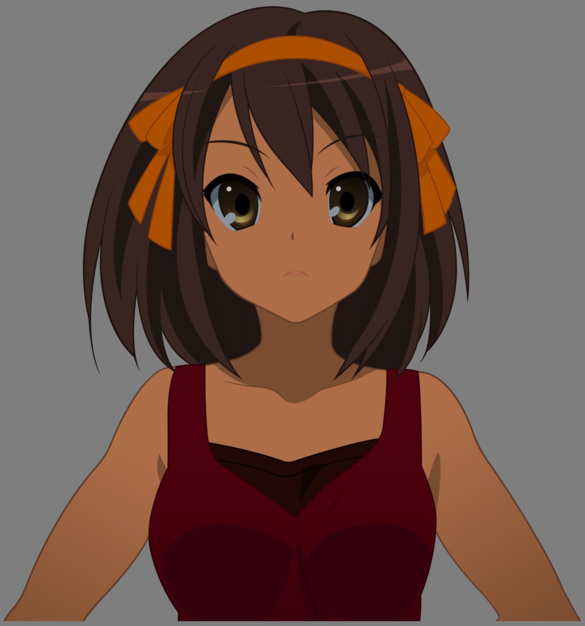
Something I started over a year ago and just decided to finish.
Also should be cropped at the bottom.
Wooky said:
looks pretty dark?
Considering the clothes, I'd be willing to pass it off as her having a tan ^_~

van said:
Also should be cropped at the bottom.
This, on the other hand, is too obvious to ignore. Haruhi needs to be moved down or the image cropped a bit. Vectorer might've missed it since it's a transparent BG normally. (I tend to keep a layer with a single solid color other than black/white when I use transparency to doublecheck and catch myself in this regard. It helps a bit. I just flip it on/off as needed to check my transparencies.)
StahnAileron said:
Considering the clothes, I'd be willing to pass it off as her having a tan ^_~

This, on the other hand, is too obvious to ignore. Haruhi needs to be moved down or the image cropped a bit. Vectorer might've missed it since it's a transparent BG normally. (I tend to keep a layer with a single solid color other than black/white when I use transparency to doublecheck and catch myself in this regard. It helps a bit. I just flip it on/off as needed to check my transparencies.)
The border is normal, all of my vectors have space around them. I prefer keeping my work off the edges. The bottom is a little larger than normal, I had to delete some small parts off the bottom and I just left it, I didn't think it was enough to warrant moving the entire vector down.

Also, the original picture is her standing under shade, she had some small highlights on her I omitted because without the context of the background it didn't make much sense. I decided to keep the other colors close to the original. I was thinking of doing all new highlights and shadows to make it look more like a normal picture, but we'll just see when I get on that, I'm not a very motivated vector person anymore.
fluke said:
The border is normal, all of my vectors have space around them. I prefer keeping my work off the edges. The bottom is a little larger than normal, I had to delete some small parts off the bottom and I just left it, I didn't think it was enough to warrant moving the entire vector down.
I never noticed this about your vectors before. Though I know why: Yande.re's shift to a gray BG for transparencies brought this about. The original settings defaulted to black and blended in with the site's BG on post views. As such, I never noticed the border on vectors you did with cropped sections. (Such as Haruhi's body in this case.) I prefer my vectors on edge for clean look, but a margin isn't a bad idea when I think about. It's a tranparent BG anyway (assuming one DLs the actual PNG and not the JPG sample), so I guess it's a moot point in the long run ^_^;

fluke said:
Also, the original picture is her standing under shade, she had some small highlights on her I omitted because without the context of the background it didn't make much sense. I decided to keep the other colors close to the original. I was thinking of doing all new highlights and shadows to make it look more like a normal picture, but we'll just see when I get on that, I'm not a very motivated vector person anymore.
Is the original on Yande.re? I used to be a mod/admin (technically I still am, though on hiatus) on Konachan.com. Our practice there is to parent a vector back to the image that the vector was made/inspired from. That why is a vector looks odd for some reason, looking at the linked parent might help explain the context.
StahnAileron said:
I never noticed this about your vectors before. Though I know why: Yande.re's shift to a gray BG for transparencies brought this about. The original settings defaulted to black and blended in with the site's BG on post views. As such, I never noticed the border on vectors you did with cropped sections. (Such as Haruhi's body in this case.) I prefer my vectors on edge for clean look, but a margin isn't a bad idea when I think about. It's a tranparent BG anyway (assuming one DLs the actual PNG and not the JPG sample), so I guess it's a moot point in the long run ^_^;

Is the original on Yande.re? I used to be a mod/admin (technically I still am, though on hiatus) on Konachan.com. Our practice there is to parent a vector back to the image that the vector was made/inspired from. That why is a vector looks odd for some reason, looking at the linked parent might help explain the context.
I took the screenshot myself, from what episode I could not say anymore. I'd have to rewatch them. I hadn't thought about uploading it and the bad part is, in an effort to keep my .ai files small in size I delete the original artwork layer I vectored on top of aaaannnndddd...I deleted the original picture too since I was done with it. I do have a picture of her in same clothes, similar stance but completely different shading.