This post belongs to a parent post.
|
|
Please log in. To create a new account, enter the name and password you want to use.
If you supplied an email address when you signed up or added a email later, you can have your password reset.
|
|
petopeto
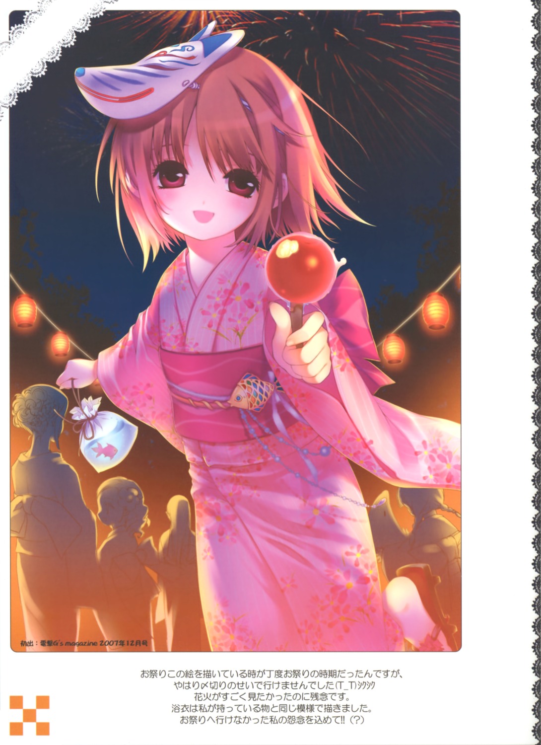
over 16 years agoThese scans (like most of his) look washed out to me. Maybe it approximates how the paper looks when held next to the monitor, maybe it's even how it was intended to look; I'm not sure, but as a matter of taste, I just find it hard to look at on a monitor.
So I'm just posting this one for levelling feedback before doing them all. The original is post #24742. This sample is levelled with 20, .95, 248; alternatives welcome. I don't want to over-level but it might be possible to improve the contrast a bit more.
I've also cropped off the black area around the edge, which also doesn't look great on a monitor. I may crop the white area and text, too. The actual posts will probably be high-quality JPEG (the levelling is slightly lossy anyway) with the original PNGs as children.
MDGeist
over 16 years agoMDGeist
over 16 years agosee post #24780
this was just transformed with 1 click (read: --ONE-- click) using PS and the original image
petopeto
over 16 years agoOne trick is to create an adjustment layer, set it to auto levels, and to set the opacity on the adjustment layer, so you can use auto levels to pick the ranges, and then tone it down as wanted...
aoie emesai
over 16 years agops: What exactly is a "sample" tag?
petopeto
over 16 years agoMDGeist
over 16 years agoand i changed CONTRAST not LEVELS...
theres autolevels, too, but with different result