This post has a child post. (post #65102)
« Previous Next » This post is #079 in the POP - Super Lollipop pool.
|
|
Please log in. To create a new account, enter the name and password you want to use.
If you supplied an email address when you signed up or added a email later, you can have your password reset.
|
|
« Previous Next » This post is #079 in the POP - Super Lollipop pool.


petopeto
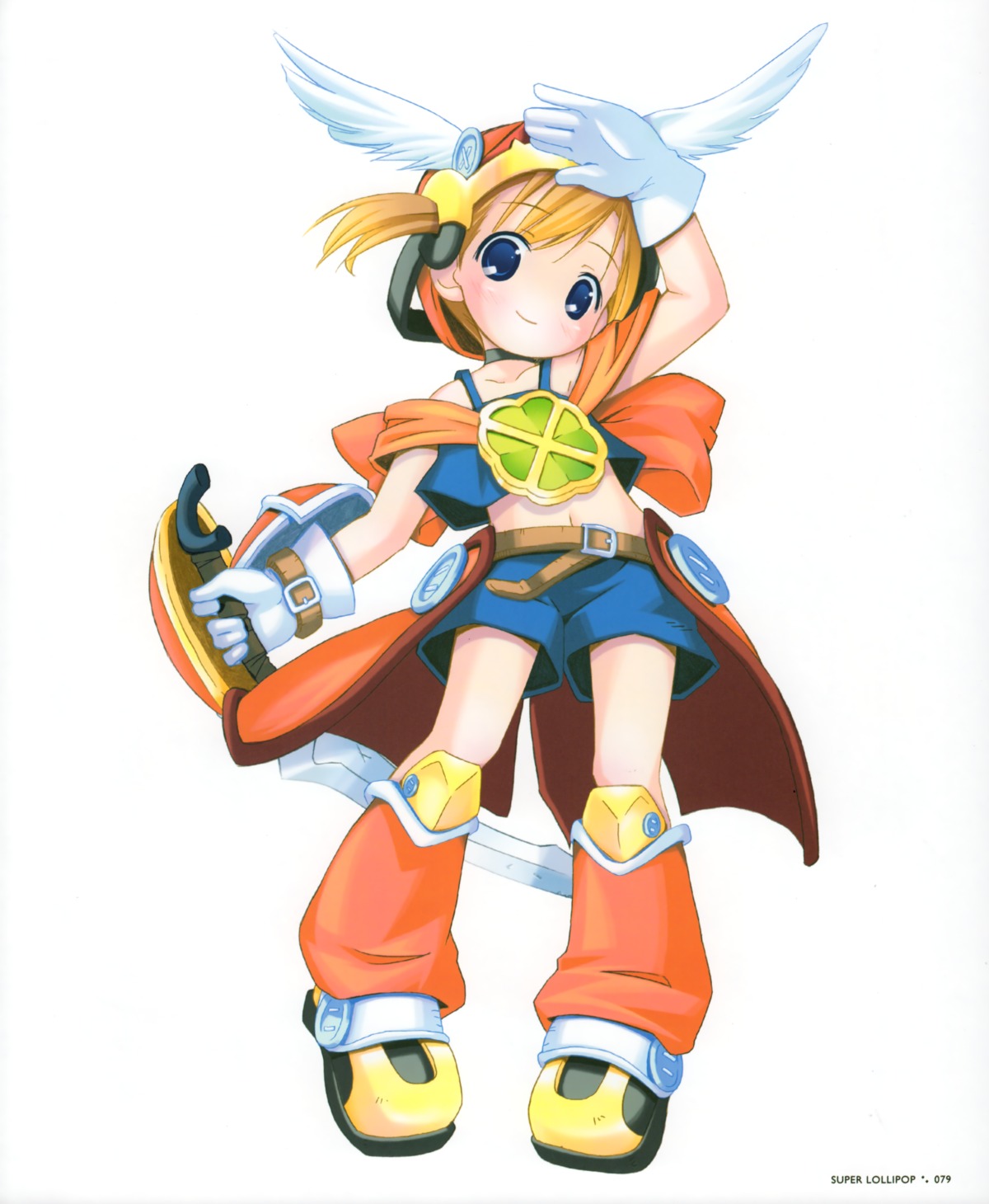
almost 16 years agoI also posted an earlier revision of each, with a bit less of a gamma shift: I kept pulling it down and down and I started getting nervous that I was overdoing it, since the book really is very light, but it's still very close and I think the darker ones do look better on a monitor. (My monitor is very bright, which could be a factor, but it's gamma that was being pulled down, not brightness.)
So, open for input, especially if you have the book to compare. post #65103 (+post #65102), post #65101 (+post #65100), post #65105 (+post #65104).
MugiMugi
almost 16 years agoas for the pictures itself, they feel a bit tad to smothed out and a bit washed out due that.
cheese
almost 16 years agopetopeto
almost 16 years agoThe gamma can go lower without looking "wrong", but it starts to look significantly darker than the book, and I'm not sure where the best balance is.