Close
This post has a child post. (post #367111)


silica sword_art_online thighhighs transparent_png vector_trace

Edit | Respond

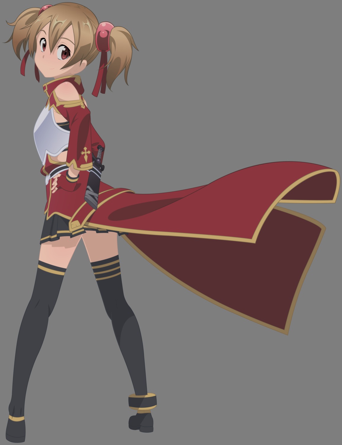
It's nice (I even looked at the full original), but I find this looks a bit washed out with the lack of contrast in the coloring. Everything but her eyes seems to just blend in and faded into one another (becoming somewhat indistinct). Her eyes, by contrast, are quite sharp and distinct.
StahnAileron said:
It's nice (I even looked at the full original), but I find this looks a bit washed out with the lack of contrast in the coloring. Everything but her eyes seems to just blend in and faded into one another (becoming somewhat indistinct). Her eyes, by contrast, are quite sharp and distinct.
I'm glad you like her eyes, I absolutely hate them. I re-did them 3 times. Suggestions on how to change the washed out look? Should I change the outline colors, brighten up the object colors?
Hmm... I would try to make the outlines more distinct: make them sharper or darker. (I can't readily tell because of the lack of contrast, but the line work looks a little too soft/overly anti-aliased. Again, that COULD be a side-effect of the general lack of contrast between the line work and the fill/object colors.)

I think darkening the lines and making them stand out a bit more should be all you would need to do. Part of the reason the eyes look better is because of the black and white (or darks and lights) composing them. It makes it easier to pick out the details. (Human eyesight is mostly based on contrast between colors/shaded.)

Give it shot and see how it comes out... Hopefully it'll work out for you ^_^
Just poor choice of outline colors.
StahnAileron said:
Hmm... I would try to make the outlines more distinct: make them sharper or darker. (I can't readily tell because of the lack of contrast, but the line work looks a little too soft/overly anti-aliased. Again, that COULD be a side-effect of the general lack of contrast between the line work and the fill/object colors.)

I think darkening the lines and making them stand out a bit more should be all you would need to do. Part of the reason the eyes look better is because of the black and white (or darks and lights) composing them. It makes it easier to pick out the details. (Human eyesight is mostly based on contrast between colors/shaded.)

Give it shot and see how it comes out... Hopefully it'll work out for you ^_^
If it appears more anti-aliased it's because I put a blurred transparent layer over my vectors to give them a soft look that I like. I usually start with one color sample when doing the lines and after I color, or as I color it, I often change the line colors to more closely match the object colors so they don't stand out terribly. Maybe I chose them too close to the object colors this time.
IMHO, I think the blurring makes the image a little TOO soft, but it's the color choice that seem to be the main issue. (The blurring effect just compounds the coloring blending issues and therefore the lack of contrast.) Like I said, just darkening the outline colrs should be enough.
Oh,why do u want high contrast?The soft color is good,if u want to do this,I suggest u deepen the dark,the brightest part is not bright enough too,The highlight must nearly the light source,and all of this is not the keypoint,Hair looks uncomfortable.