This image has been resized. Click on the View larger version link in the sidebar for a high-quality version.
Hide this message.
This post has a child post. (post #364559)
|
|
Please log in. To create a new account, enter the name and password you want to use.
If you supplied an email address when you signed up or added a email later, you can have your password reset.
|
|


LolitaJoy
over 8 years agoCould the artist have been any more lazy?
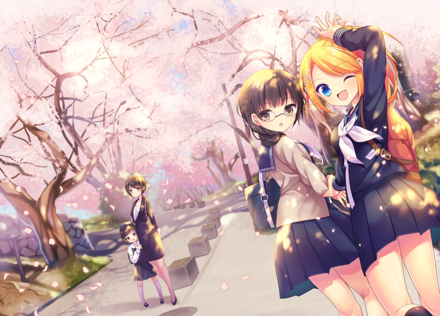
The eyes have no soul, they are spaced too far apart, and placed too far down at an awkward angle.
The eyes do not match the mouth at all, they look like they were copied and pasted onto her face with half-assed effort.
The mouth shape is ugly, it does not fit well at all on her face.
The whole face is awkwardly angled. Nothing looks naturally placed.
All of her facial features could be sliding all over the damn place and it wouldn't make much difference.
Not to mention her right hand, what the actual fuck is going on there?
Looks like an inhuman mutated blob attaching itself to glasses girl.
And the two characters off to the left, don't even look like they are standing on the ground at all. More half-assed copy/pasting.
The trees are godawful as well. Their branches look like textureless tentacles extruding pink blobs of matter.
The artist did a poor job of making the scene's dimensions look realistic.
Nothing looks natural. Nothing fits together. There is no consistency. There is no life to the artwork.
I feel like if i reached out to touch it, everything would start melting.