This post belongs to a parent post.
|
|
Please log in. To create a new account, enter the name and password you want to use.
If you supplied an email address when you signed up or added a email later, you can have your password reset.
|
|
blues
almost 18 years agoAnonymous
almost 18 years agoOniZai
almost 18 years agoGreat for drawing referrence.
blues
almost 18 years agomahouneko
almost 18 years agomahouneko
almost 18 years agohttp://www.megaupload.com/?d=R6CVGAJP
gagoman
about 17 years agoKuroda
over 15 years agoInu never fails to impress.
Debbie
over 15 years agoInu failed.
c:
MomoKun
over 15 years agothe face isnt awful xD
great pic^^
Debbie
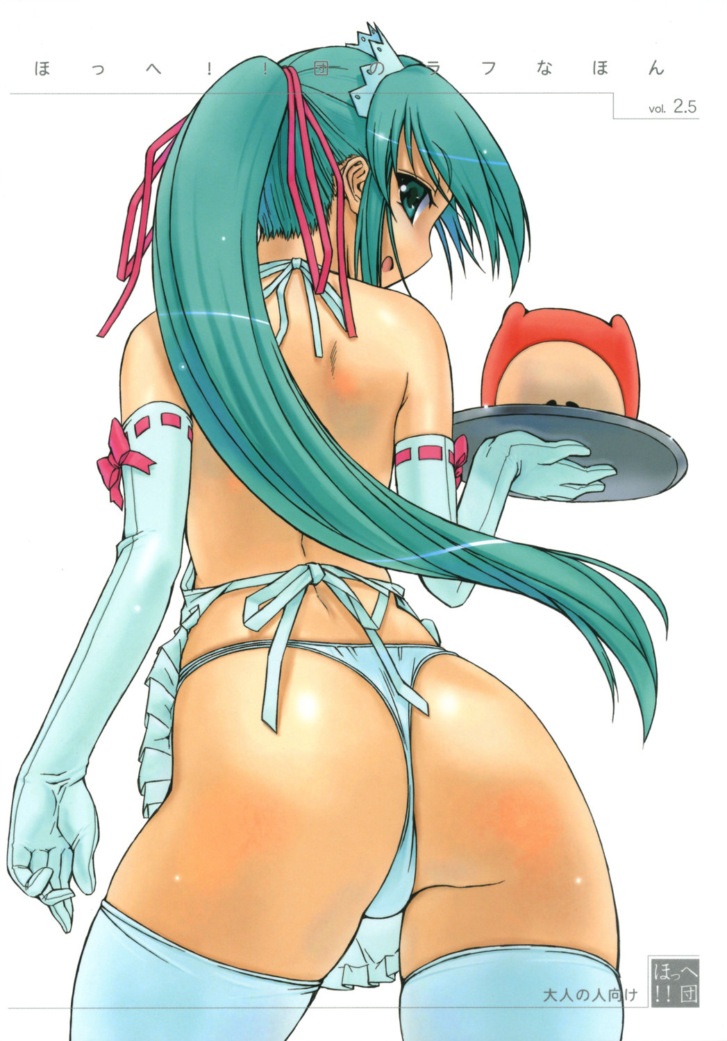
over 15 years agoAnd I don't like her hair either, mainly on the head, next to the ears. It has too many details next to the rest of the hair, it seems like her hair "changes"...
And have you noticed the size of her neck?
Also, take a look at her "pretty" ears.
Although her mouth is eeky, her hands are really good and nice coloring on the butt. In general, the picture is okay. But, IN MY OPINION, the most important thing on a picture is the face. This includes: hair, nose, mouth, and mainly eyes. Mouths like these http://moe.imouto.org/post/show/49476/lump_of_sugar-moekibara_fumitake-screening-spica-s are way too low and can easily ruin the picture. No matter how beautiful the body and background is, a pretty face is necessary to a great picture. In the case of the witch picture, I'd bring both nose and mouth a little up. It would look really cuter.
That was really offensive.
I'm a bit shocked.
Radioactive
over 15 years agoDebbie
over 15 years agoIt must be really boring to see people asking what does something mean. :/
*remembers of futanari case*
Radioactive
over 15 years agoDebbie
over 15 years agoIt makes sense now. Thanks. :3
midzki
over 15 years agoMomoKun
over 15 years agobut i think the pic is beautfil. the face too. not everything must be perfect :P
Debbie
over 15 years agoReally, who chooses what will be released on this Megami Magazine? o_õ
Ah, okay then! :-D Mom says I take everything as an offense...
asterixvader
over 15 years agobesides, all artists draw weird details, like post #64620. take out that tie thing she has around her neck. the result? a thin and long neck, like Olive's.
Debbie
over 15 years agoBut yes, her mouth is awful, not that the mouth itself is awful... It's just the place where it was drawn.
Also, she has too thin arms for someone who has such a big butt and neck.
And her ponytail isn't very detailed, it could be better.
I'd give this picture a 8 out of 10 what means it isn't that bad.
I see, Carnelian loves drawing long bodies, and sharp edges elbows, and I never liked sharp edges elbows. But Carnelian's neck is almost unnoticable, on that case, while in this picture, the detailed part of the hair made the neck "scream".
Whatever. I prefer Carnelian. :P
asterixvader
over 15 years agoi also had my times when i used to judge every detail on pics.
but uh, i got tired of myself and accepted every artist has their own style (of course some just can't be tolerated). after all i can't do any better, yet.
Debbie
over 15 years agoI'm working to do better than this. :)
Although I'm still far.