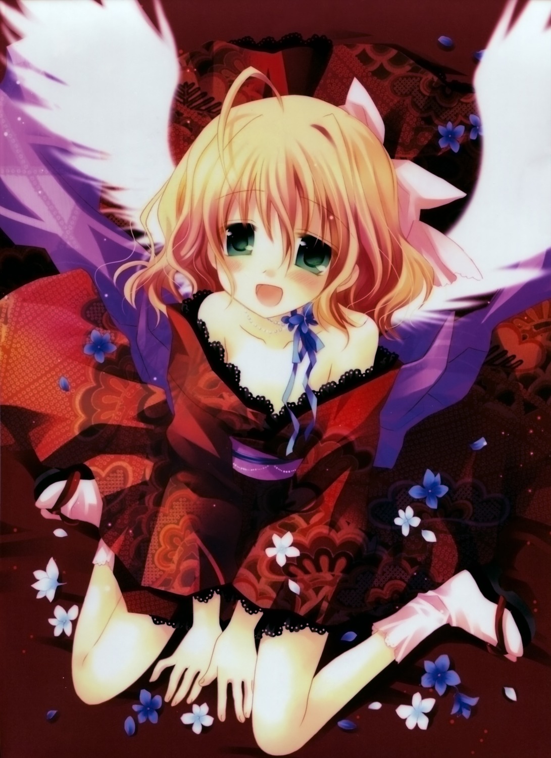
This image has been resized. Click on the View larger version link in the sidebar for a high-quality version.
Hide this message.
This post belongs to a parent post.
|
|
Please log in. To create a new account, enter the name and password you want to use.
If you supplied an email address when you signed up or added a email later, you can have your password reset.
|
|


petopeto
about 16 years ago(It also brought the brightness down as an unintended side-effect; a better fix would probably be to decrease green less, and increase red and green, so it doesn't darken the image. I'm not sure if there's a simpler way to do that...)
midzki
about 16 years agofor adjusting colors im myway,
1) adjust RGB ratio at the brightest point
2) adjust RGB ratio at the middle point (gammmas)
3) adjust master curve to get best contrast balance between shadows & others.